How to Design a Water Bottle Label People Remember
A practical guide to water bottle label design for Karachi businesses. Logo files, colours, text size, QR codes and the mistakes that make labels forgettable.
By the Siratim team · · 8 min read
A bottle of water sits on the table for the whole meal, meeting or appointment. Your guest picks it up, turns it around, reads it, and sometimes takes it to the car. Very few pieces of branding spend that much time in a customer's hand. Good water bottle label design uses that time well. Poor design wastes it on a tiny logo, unreadable text and colours that disappear against the water.
This guide is for restaurant owners, cafe managers, salon owners, clinic administrators and event planners in Karachi who are about to put their name on a bottle. You do not need to be a designer. You need to know what works on a small curved surface, what to send, and what to check before you approve the print.
What a water bottle label design has to do
A label is not a flyer. It has one main job and two small ones.
- Main job: make your brand recognisable in one glance. Someone across the table should know whose bottle it is.
- Small job one: give people one way to reach you. A phone number, an Instagram handle or a QR code.
- Small job two: look clean enough that the guest trusts what is inside. A crowded, blurry label makes the water feel cheap, even when it is not.
Everything else is optional. If an item helps none of these three jobs, leave it off.
Start with the space you really have
The most common mistake in water bottle label design is working on a big flat screen and forgetting how small and curved the real thing is.
A label wraps around a cylinder. At any moment a person sees only the part facing them. That gives you three working zones:
- Front panel. Your logo and, if you want, a short tagline. Nothing else.
- Side panel. Contact details, QR code, social handle.
- Back or overlap area. Product information and anything that must be there but does not need attention.
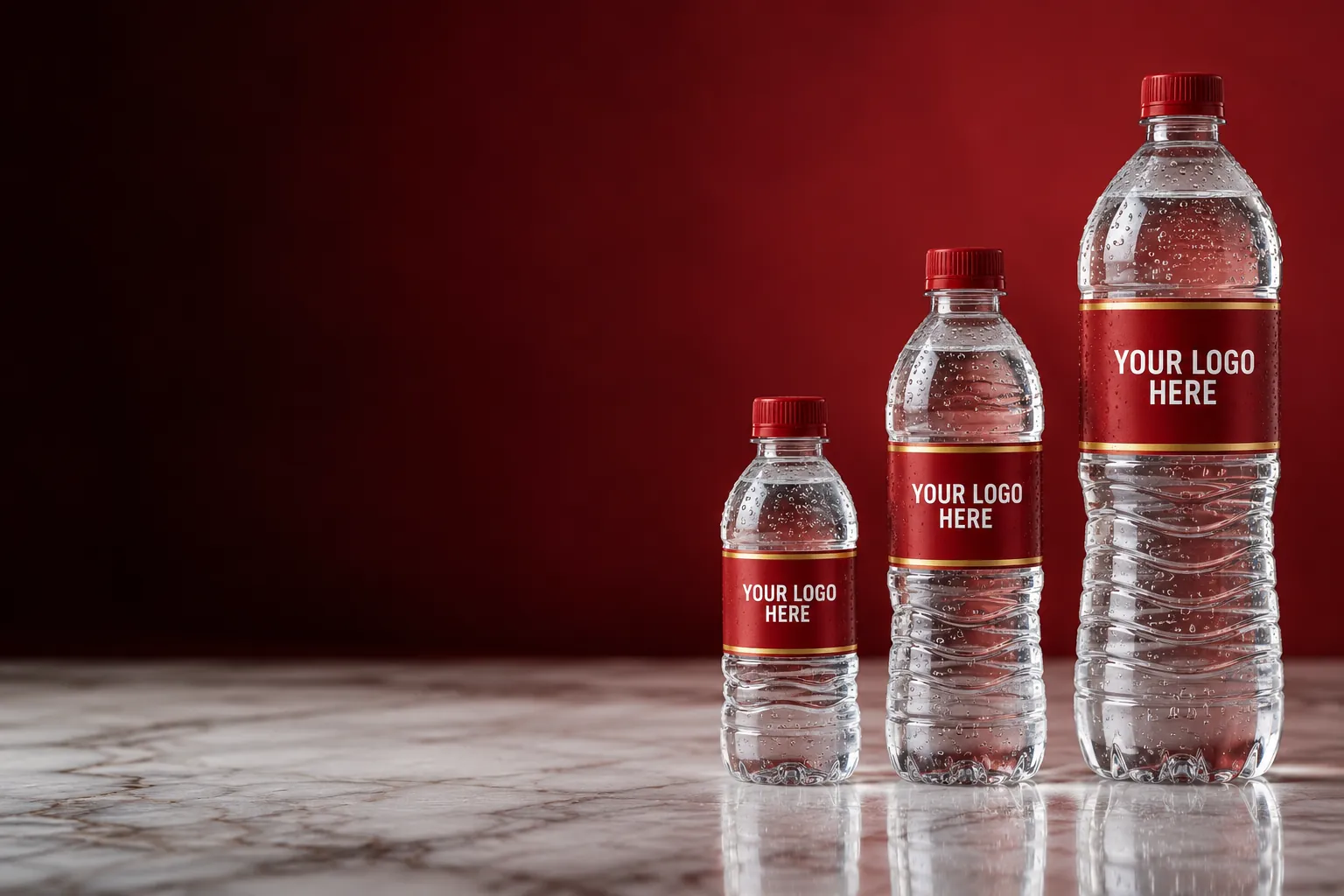
Bottle size changes the canvas as well:
- A 300 ml bottle has a short, narrow label, so the design must be very simple.
- A 500 ml bottle gives comfortable room for a logo plus a contact panel.
- A 1.5 litre bottle has the biggest label and is usually seen from further away, on a dining or conference table, so the logo can and should be larger.
If you plan to order more than one size, design the smallest first. A layout that works on 300 ml scales up easily.
Here is a simple test. Print your draft at actual size on normal paper, cut it out, tape it around any bottle, and put it on a table. Step back to arm's length. What you can read from there is what your customer will read.
Get your logo file right
Print quality starts with the file you send. A logo saved from a WhatsApp profile picture or a Facebook cover will look soft or pixelated on a printed label, because those images are small and compressed.
Send one of these, in order of preference:
- Vector file: AI, PDF, SVG or EPS. Vector artwork can be scaled to any size without losing sharpness. If a designer made your logo, they have this file. Ask for it.
- High-resolution PNG with a transparent background. Acceptable when no vector exists. The larger, the better.
- Anything else. A signboard photo or screenshot can serve as a reference for redrawing, but not for printing.
Two more technical points are worth knowing:
- CMYK, not RGB. Screens mix light in RGB. Printers mix ink in CMYK. Very bright screen colours often print a little duller. If your exact brand colour matters, say so early.
- Fonts. If your design uses special fonts, convert the text to outlines or send the font files, so nothing gets swapped during printing.
No usable logo file? Siratim offers label design help, so you can send what you have and work from there.
Colour, contrast and the clear-bottle problem
A water bottle is a strange background. The bottle is clear, the water is clear, and whatever is behind it shows through: a white tablecloth, a dark wooden table, a hand.
That leads to a few practical rules:
- Use a solid label background unless you have a specific reason for a transparent one. Solid white or a solid brand colour keeps the logo readable on any table.
- Go for strong contrast. Dark text on a light background, or light text on a dark one. Mid-grey on light blue looks elegant on a screen and vanishes on a cold bottle.
- Expect condensation. A chilled bottle fogs up and collects drops. Fine lines and pale pastel text are the first things to disappear behind them.
- Limit your palette. Two or three colours from your existing brand are enough, so the label matches your menu, signboard and packaging.
Blue is the default colour of bottled water, which is exactly why it is forgettable. If your brand is maroon, black, gold or green, use that. The bottle that does not look like every other bottle is the one people notice.
Finish matters too. Gloss and matte are covered in waterproof bottle labels explained.
Text: what to include and what to leave off
Every extra line of text makes every other line smaller. Be strict.
| Element | Include? | Notes |
|---|---|---|
| Logo | Always | The largest item on the front panel |
| Business name in text | If your logo is a symbol only | Keep it close to the logo |
| Tagline | Optional | One short line, not a paragraph |
| Phone or WhatsApp number | Usually | Large enough to read at arm's length |
| Instagram or Facebook handle | Usually | One or two platforms, not five icons |
| QR code | Optional | Link to a menu, booking page or map location |
| Full address | Rarely | A short area name such as DHA or Clifton is often enough |
| Long descriptions and service lists | No | Nobody reads them on a bottle |
A few tips on QR codes:
- Keep the code large enough to scan easily, and leave clear space around it.
- Print it dark on a light background.
- Test it on the proof with two different phones.
- Link it to a page you control, so you can update the destination without reprinting labels.
Keep all text away from the edges. Labels can shift slightly when they are cut and applied, so leave a safe margin on every side. Do not place anything important where the two ends of the label overlap.
Some space is normally needed for basic product information such as the volume. Ask how much room to keep free when you request a quote.
Water bottle label design ideas by business type
The same rules apply everywhere, but the emphasis changes with where the bottle will be used.
- Restaurants. The bottle sits beside your plates and appears in customers' photos. Match the menu design. A QR code to your menu or delivery page earns its place. See branded water for restaurants.
- Cafes. A clean, bold front panel and an Instagram handle usually work better than a phone number. See cafes.
- Salons and barber shops. Clients sit for a long time with the bottle in front of the mirror. A booking number or WhatsApp line is the most useful detail. See salons and barber shops.
- Clinics and hospitals. Calm colours, plenty of white space and a clear appointment number. Avoid anything that looks like an advertisement. See clinics and hospitals.
- Corporate events. Event name, date and sponsor logos, arranged in a clear order of importance. More in branded water bottles for corporate events.
- Weddings. Names, date and a motif from the invitation card. No phone number needed. Ideas in wedding water bottle ideas and sizes.
Want to see how finished labels look on real bottles? Browse our work before you start.
Mistakes that make a label forgettable
- A small logo surrounded by clutter. If everything is important, nothing is.
- Too many fonts. Two is plenty.
- Thin, light or script text for phone numbers. Numbers must be plain and bold.
- Ignoring the fridge. A label that peels or smudges when cold undoes all the design work.
Check the proof before you approve
Before production you should receive a proof, which is a final image of the label for your approval. Treat it seriously, because a mistake on the proof is repeated on every bottle.
- Read the phone number out loud, digit by digit.
- Check the spelling of your business name, social handle and web address.
- Scan the QR code from the proof itself.
- Compare the colours with your menu or business card, and ask if something looks off.
- Confirm which bottle size the proof is for.
- Show it to someone who has not seen the design. Give them three seconds, then ask what they remember. If they say your name, the design works.
The full process, from first message to delivery, is explained in how it works.
Get a quote for your water bottle label design
Good water bottle label design is mostly restraint: a big clear logo, strong contrast, one way to contact you, and a file sharp enough to print.
Siratim is based in Karachi and supplies custom-label water bottles in 300 ml, 500 ml and 1.5 litre sizes, with full-colour printed labels and help with the design. Send your logo, preferred size and rough quantity on WhatsApp at 0339-0101119, email info@siratim.com, or use the quote form on the contact page. The team is available Monday to Saturday, 9 am to 7 pm.
Quick answers
What file format should I send for my water bottle label?
A vector file such as AI, PDF, SVG or EPS is best because it prints sharp at any size. A large high-resolution PNG with a transparent background is the next best option.
What should I put on a custom water bottle label?
Your logo, one way to contact you such as a phone number or Instagram handle, and optionally a QR code. Keep long text and service lists off the label.
I do not have a proper logo file. Can I still order?
Yes. Siratim offers label design help, so you can send whatever you have, such as a photo of your signboard or a business card, and the label can be worked out from there.
Should I choose a solid or a transparent label background?
A solid background is the safer choice because it keeps your logo readable on any table and when the bottle is cold and fogged. Transparent labels need very bold artwork to work.